Solving Marketing Problems With Perceptual Fingerprints
I'm going to skip some steps and dive into a really technical tool we use at PivotNine. By which I mean simple spreadsheet and a graph. It's a thing we use to coach clients to have a market orientation, which is a fancy marketing term for “caring about what customers want”.
Lots of tech companies find this hard because they really like the shiny tech they've built but if you tell them no one cares, that makes them sad. Customers mostly care about their own problems not which Javascript framework you used. Weird, huh?
Researching Customer Needs
Anyway, you discover what customers want through research like talking to them. Customer interviews where you really *listen* are really good for this. You listen to what people are trying to do and what they care about, and then you try to group those things into a few categories. These are your “customer needs”.
You generally need a few of them, but not too many. 7-10 seems to be a good number in our experience. Stuff like ‘Support' and ‘Control' or ‘Modern' and ‘Ease-of-Use'.
Then we put them in a spreadsheet, like this:

Spreadsheets like numbers, so let's add some. For each category, we rate how important it is to our customers on a scale of 0-10 where 10 is very important and 0 is not at all.
“But customers want different things!” Indeed! But you might notice clusters of customers who want similar stuff to each other, but the clusters are somewhat distinct from each other. You have discovered the mysterious art of ‘segmentation'.
Rating Segment Needs
For each distinct segment, you should be able to put a number in each category that represents the average (mean, median, whatever best matches what average means) for that segment.
Now look at the product(s) you're trying to sell to these people, and rate them *from the customer's perspective* for those same categories.
[All the numbers in this example are made up btw]
You can do this yourself, if you think you can be honest. Or you could commission some actual quantitative research to figure this out. Or you could ask someone like us to tell you your baby is ugly.
Rating Product/Need Fit
Next, and this will hurt, you do the same thing for all the other reasonable options your customers have that they could pick instead of you.
You can do this on the same piece of quant research, or we can help you walk through this process. For products that are being actively built, doing a survey might not work but we can talk about that with you.
You will end up with a spreadsheet full of numbers like this:
During this process, you may decide your categories are wrong. Great! Change them to something that makes more sense.
We often find that this process forces clients to think about their customers or their product more clearly than they have before. Having to write this stuff down means you have to be much clearer about it than whatever is sloshing around in your head.
That's really important when there's more than one of you on the team, because you probably can't read minds and sometimes people have very different ideas of what their product is good at or what customers value. Just getting the whole founding team to clearly agree on the categories can be a big win all by itself.
That's one of the secrets of consulting: yes, we get you to tell us stuff you already know, but if you could have done it without us, you would have already done it.
We can do stuff with this big wall of numbers. And by stuff I mean maths. Yes, there will be a quiz.
The Magic… of Maths
We can do a kind of k-means distance measure to determine how close each option is to the customer's ideal by comparing the sumproduct of each row. Some conditional formatting highlights the extremes.
A large number indicates a large average difference between an option and what a customer wants, while a small number indicates a small difference.
This helps us get away from notions of ‘best' and towards an idea of ‘good fit'. Customers usually want something that suits their needs, not some arbitrarily ‘best' product. Is an F1 car ‘better' than a minivan? Is an egg ‘better' than a screwdriver?
It depends on what you're trying to do, so comparing a $14m-a-year enterprise SaaS product to a $500 one-off-purchase for SMBs is a waste of time.
Product-market fit is about understanding the market, its segments, and choosing which segment(s) to go after, and making a product that fits their needs. The shape of your peg product needs to match the shape of the hole in the customer's life.
Pictures With Maths
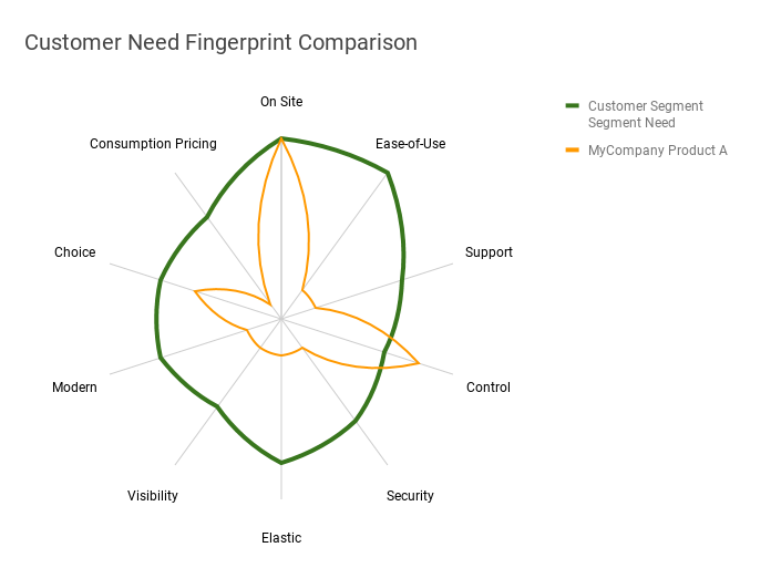
Another thing we can do with maths is draw pictures, so why don't we check out the shape of the customer need, and the shape of our product?
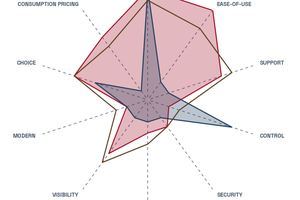
Here's a radar chart of the categories and the options:
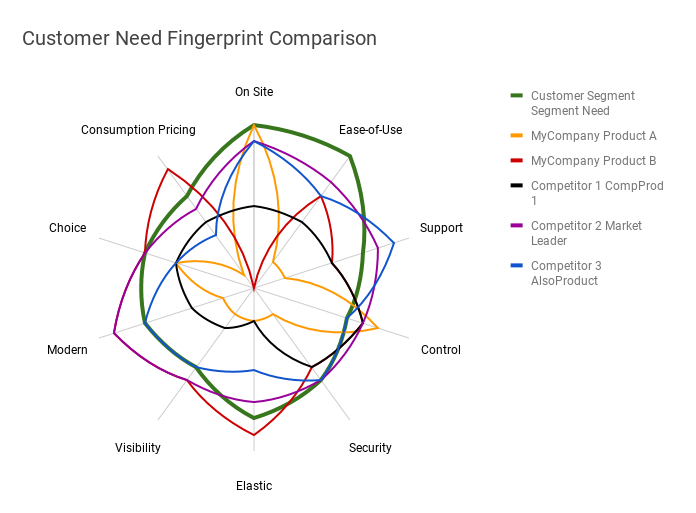
Answering Questions With Graphs
We can use filters and visually display important concepts like “Your product is terrible at meeting customer needs”…
“…and it's obvious why your main competitor is winning.”
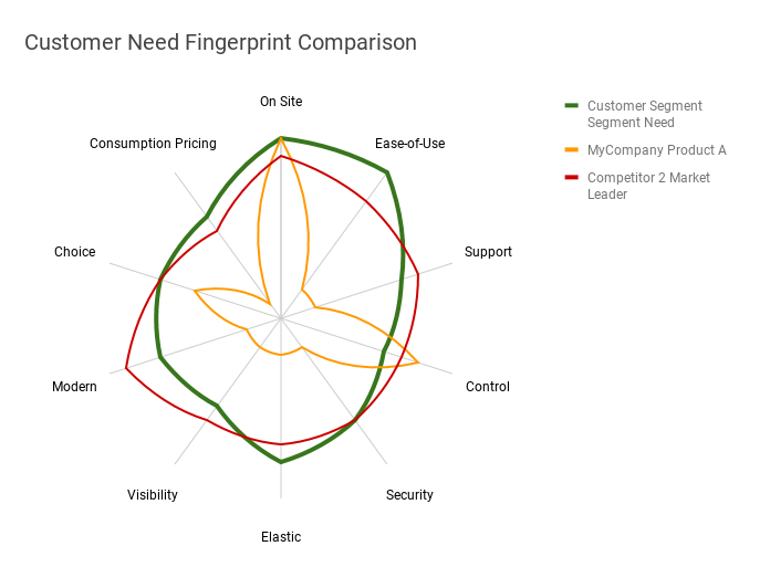
Is this useful? Yes! Because we now know what to fix. We either need to find a different set of customers that need what we've built, or we need to change our product to suit the target segment's needs.
That's just the start of what you can do with a Perceptual Fingerprint.
See also
Related items

The Reward/Experience Framework
Technology companies tend to focus on a narrow set of benefits while customers have a much richer set of benefits that they value. Actual human beings are not purely rational creatures, and we should take this into consideration when making marketing decisions.
The Perceptual Fingerprint™
A tool for analyzing and aligning vendor offers with customer needs.

Analysis of Rubrik's IPO S-1
Rubrik has filed its Form S-1 in preparation for an IPO. We analyse what the filing says about Rubrik's strategy and the opportunities for customers and competitors.